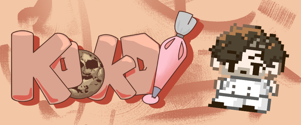
Kookd
Devlog 3 -- Playtesting
Playtest
(Info edited and added by Alice Du)
Playtesting was conducted at OCAD University in the Rosalie Sharp Pavilion on April 1st, 2025. To gather player feedback, our team created a Google Form featuring questions contributed by each design group. Additional observations and notes were recorded throughout the session to supplement the responses collected through the form.
Playtest Questions & Responses From Google Form
Questions are in black and answers from our form are italicized
Narrative Design:
1. How do you feel towards the characters in the game? Did you feel sympathetic to the MC, feel incentivised to defeat the boss?
- Yes I do
- I didn’t know I had to defeat a boss
- Yeah quite a bit
2. What was the game-feel you experienced while playing Kookd? Did any narrative aspects enhance this feeling? Did they take away from this feeling?
- I feel like the games has a charm to it
- Cute
- Yeah I think it makes connection between the player and the character?
3. How did you find the pacing of the story? Did the transition between the real world and the Doughverse overwhelm you, feel natural, etc?
- The pacing of the story seems to be ok. The transition between rounds didn’t feel overwhelming
- Seemed fine
- It’s quite interesting, swift between real world and doughverse is a lot different and engaging
UX UI Design:
1. Can you demonstrate navigating from the home screen of the game to the baking section?
- N/A
2. Does the layout of core functions such as the back button, settings and pause button remind you of another interface? (game or social media) Is it known and familiar?
3. Is the User Interface easy to understand and navigate through? Is there anything that you find inconveniencing to do through the UI? I.e playable screen area (is it crowded)
- I feel like it was easy enough to understand the movement keys, but it would’ve been nice to have an indicator to show what the key binds are.
Level Design:
1. Describe your experience while moving around the level. Was it clear and smooth? What do you think needs improvement?
- Moving around the level was pretty easy, and I could notice some very obvious barriers that prevent you from moving on in the story
- It’s quite clear, maybe adding a map will be better
2. Were there any points where you felt lost/unsure of where to go next?
- I was a little unsure of where to go and begin the game
- Everywhere, there was no instructions
- Yes, the map is quite big and the signs are confusing
- Yes
- Maybe Unlockable maps
- Maybe make the directional arrows more obvious
3. What is your impression of the world building of the levels? Does it compliment the game/fit well?
- Enjoyed the animations and cute treats
Content Design:
1. Is the character art in the game appealing enough/ attracts you? Are the designs unique and suit the theme of the game?
- The character are in designs are really amazing and they fit the theme of the game
- Very much. It’s great
- Yeah the characters are great so far
2. Is the animation of characters movement smooth enough/ any suggestions on the character movements?
- The animation of the character moves very smooth
- Smooth but it was jagged at time
- Character walks smoothly, attack animation is cool
Technical Design:
1. Is the combat fun and satisfying?
- I found the combat OK but I feel like a feature that could be important is some kind of indicator to show that the enemies taking damage.
2. Are there any bugs you found? What were they?
- N/A
3. Are there any features you would like to see implemented?
- N/A
Mechanical Design:
1. Do you find the battles challenging in a good way or bad or was it way too easy? Was there enough variation of gameplay that each level and fight felt unique?
- I found it a little confusing to understand if the marshmallow enemy was taking damage
- There’s not many battles yet, not sure
2. Did you find you were in control of the outcomes of the game?
- A little
- Kind of
Playtesting Notes Written by Everyone
Below you can list anything you notice while playtesters try our game that should be noted (challenges the player faces, reactions, bugs/errors, etc.) Jot notes/point form is totally fine!
- Add enemy knockback when player attacks
- Day system!!!
- Sprinting keybind
- Mini map (whatever group)
- Keybindings in tutorial
- Clarity in combat
- Check shape of colliders for level assets (lvl 1)
- Extend river at the border
- collision/box colliders should help
- make player faster than strawberry (sprint option)
- flesh out core mechanics
- add boundaries to map
- Tiny map would be helpful
- add instructions on what u need to do
- add clouds closer to edge of bridge to help create barrier
- indicate people to pay attention to the clouds, maybe in a tutorial
- make walking speed a bit faster
- Yang likes the sprites
“I like the art stuff”
Playtesting Notes from Iris
Current Progress
- Basic combat
- Character controller
- Full map
- Interractable chests + buttons
- Animations for all weapons/game tools
- Aesthetic assets
- UI assets [buttons/health/loading/menu]
- Story is fleshed out (in writing)
- Tutorials are fleshed out (in writing)
Well Done
- Narrative generally good, especially story wise and content it very effectively allows the player to understand the atmosphere of the game
- Assets and animations have a good flow and consistent aesthetic enhancing the narrative
- Overall map looks great and it is very engaging, especially since it allows for further engagement during game progression [note: not yet an implemented feature]
- Basic combat implemented
- Aesthetically, the game is extremely consistent and very beautiful
Concerns
- Combat system is still very underdeveloped considering the weapon variety + shield scope
- A lot of UI and narrative has not yet been implemented cohesively leaving a lot of gaps in the game’s flow thus sacrificing UX
- There is not a lot of player guidance; goal of guidance is not clear
- Why am I progressing through the map as I fight?
- Other than exploration, how does map size enhance the experience of the game?
- Does the player know there will be a boss fight?
- A lot of assets do not have collisions and clip through
- Camera doesn’t follow through in some areas
- UX needs more work
- Interactables aren’t obvious (i-e chests blend in too much with decorative assets)
- Path signs look more like decorations than indicators
Additional Notes
- Cloud barriers need to be addressed mildly as well as placed in locations where the player doesn’t feel blocked but rather assumes there is no passage due to them.
- A subtle non UI way to imply this is through narrative. Make sure in the town you find out about (ex)
- A storm that clouded paths
- Clearing enemies in a day results in clouds lifting (this can be a dialogue line on the second day to direct the player to find new paths that seemed previously blocked by clouds)
- The monsters cause blockages, clearing more and more clears paths
- A subtle non UI way to imply this is through narrative. Make sure in the town you find out about (ex)
- The shortcuts in the map are very fun but they do add confusion to the overall exploration, consider making them a little more hidden (using assets, not by changing the map) so it can feel more rewarding when you discover them, but simultaneously keep them less relevant to the player in contrast to the main cracker path
- A minimap can be useful but you should be careful of how much screen economy it will take up. The camera is close to the player so having a map added to that could interfere a lot with how they figure out their position
- Consider moving the camera further back
- Focus on making the paths feel like the only places you can go and leaving the rest of the areas a bit more bleak or unnecessary
- Adding the necessary UI and combining all the parts of your game into one project should be your priority at the moment
Reflections from Each Design Team
Ui-Ux Design Group Reflection:
Although both Ui and Ux aspects were not implemented into the playtesting, the feedback was mostly positive and our next steps. Feedback for Ui is mostly about coding the different screens, buttons, and finishing the HP and time bar. As for feedback for UX it is lacking as Ui and narrative aspects that were not implemented affect the user experience. And UX needs a bit more work, the path signs and the chests will have to be changed to stand out as stated in the TA notes.
Our top priorities are to finish and implement the screens into the game and to finish the HP and time bar, hoping to get these main components into the game. And when the paths, chest and narrative elements are completed, this will improve the UX aspect of the game.
Narrative Design Group Reflection:
The playtesting feedback for the narrative team was mostly positive, though there are some elements that can be refined to enhance the player experience. In response to our question, “did you … feel incentivised to defeat the boss”, one playtester didn’t even know there was a boss, so that can be communicated better through the dialogue. Aside from that issue, the feedback shows that the game feel is successfully charming and cute, players feel connected to the main character, and find the Doughverse engaging due to it being far different from the real world. To enhance this charm, the narrative team can look into exaggerating the way the Doughverse differs from the real world, making it appear more fantastical.
On top of this, a lot of narrative design has not yet been implemented cohesively. The narrative team needs to work on coding the dialogue into the game to enhance the game's intended experience. Additionally, much emphasis has been put onto the narrative team creating dialogue for when players run into the path blocking clouds. The narrative team has created dialogue options for this interaction and will incorporate them into the game with the other dialogue.
Level Design Reflection:
A recurring issue with the levels from playtesters was the lack of instruction on what to do within the game and what the objectives were. Additionally, some players found the signs confusing, suggesting that the guidance I implemented were either insufficient/not noticeable enough. One suggestion from players was to make directional arrows more obvious, which I believe would be a simple fix. Another suggestion was the inclusion of a mini-map that would show the already unlocked areas, which I believe would help orient the players as they explored the levels. I think a pullout map would work better so it doesn't interfere with the screen space. I also think slowing down the characters movement would help players take in the environment and directional arrows and therefore help them make pathing decisions, as moving too fast on a map with small terrains did not allow enough time for players to decide on paths to take.
In terms of world-building, the feedback was generally positive, with players enjoying the animations and the visual elements on the levels of the game. I also heard a comment about how the chest blended in too much with the other treats on the map- maybe I could make the yellow glow behind the chest stand out more.
Content Design Reflection:
Playtest feedback on the character designs and animations was positive, with players finding the visuals appealing, unique, and fitting for the overall theme of the game. In response to the question, "Are the designs unique and suit the theme of the game?", one playtester stated, "The character art designs are really amazing, and they fit the theme of the game." Character movement was generally described as smooth, though there were a few comments noting slight jaggedness in some animations. TA Yang also expressed that they liked the sprites, reinforcing the strength of the game’s visual direction. All character designs and animations have now been fully completed by the content team. However, not all of these assets have been implemented in game yet. To support the process, the rest of the content team is ready to assist with integrating these assets on the coding side to ensure everything is properly represented during gameplay.
Mechanic Design Reflection:
Based on the Playtest notes and QnA, there has not been much of a fully developed battle system yet as well as the day system and the currency system. What the playtesters did try out were samples of the fights which they concluded to be okay, so hopefully with the combat piled together it would be less boring for the player. The one main issue was a visual representation of damage so that would be a future step that the tech team will implement.
Next steps is to do the math for the currency and to help around with battle and day cycle mechanical issues.
Technical Design Team Reflection:
We have a lot more to implement. The rest of the enemies need to be made, and an indicator that the enemies are being hit. Knockback and damage numbers are the main methods being worked on. Combat needs to be polished and the other weapons added. Other features that need to be added are dialogue, the boss, the cooking mini-game, among other things. Since the playtest lacked many intended features, it was difficult to get accurate feedback as many components were yet to be added. We will work hard to add as much as we can to the game and flesh it out as much as we can!
Get Kookd
Kookd
Explore and Fight to save your bakery!!
More posts
- Devlog 4 -- Final Assets74 days ago
- Devlog 2 -- Process Work74 days ago
- Devlog 1 -- Creative Brief74 days ago
Leave a comment
Log in with itch.io to leave a comment.